Selection
The following discuss selection methods.
Single select lists
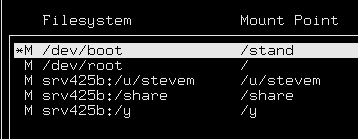
The goal for single selection is to allow the user to make a
selection, visually see that a selection was made, and then
move on with the minimum number of keystrokes. The process of moving
in the form (<Tab> or <Esc>) selects the item shown by an
asterisk next to the item. The finalizing of the choice occurs when you leave
the field. (Policy) (See Keyboard Mapping, <Esc>.)
For single-select lists, Autoselect is turned ``on''.

Multiple-select lists
The goal of multiple-select lists is for a user to make multiple
selections, visually see the marked selections, and then move on
with the minimum number of keystrokes and with no ambiguity over what items
are in fact selected. <Space> marks the selection, shown by an
asterisk (*) next to each item selected. (Policy).
-
Arrow down the list and incrementally select all the list objects
you want with <Space>. The asterisk follows as the highlight
moves, and when <Space> is pressed, the asterisk is set next to the
object, and the selected object is set to bold.
For multiple-select lists, Autoselect is turned to "off". (Policy).

Drop-down lists (option menus & combo boxes)
Selecting from drop-down lists is similar to selecting a single object
from a list. (Policy).
-
<Down> or <Up> arrow keys drop open the
drop-down list. (Policy).
-
<Esc> on a non-extended drop-down list moves to the
next <Tab> group or performs the default action as defined by
the designer. (Customize)
-
Arrow keys move through the list in an extended drop-down list. (Policy)
-
<Tab> on an extended drop down list accepts and moves onto the next
<Tab> group. (Policy)
-
<Esc> on an extended drop-down list accepts the selection
and moves to the next <Tab> group or performs the designer-defined
default action. (Customize)
-
Behavior of <Esc> must be designer-defined so that <Esc> does not
close the list and stay on the drop-down list field. <Esc> must
move to the next <Tab> group or execute the default action.
-
<Esc> from an extended drop-down list leaves the list with the
same item selected as when entering the list (cancels any
selection). (Policy)
NOTE:
Some of the drop-down list policy is being worked on and is
therefore not yet implemented.
Toggle buttons
Toggling buttons is accomplished in one step for Radio
buttons, and is performed the same way as single-select
lists for check boxes. (Policy)
Radio buttons
-
Radio buttons are grouped in a Radio box <Tab> group. (Policy)
-
Arrow keys move across the radio buttons within the Radio box.
Whatever radio button the user is currently selected (with the
arrow key), is the one that displays the checked status
(*). (Policy)
For the user, this is similar to functionality for the drop-down
list. Also, the asterisk moves with the arrow, which intuitively shows
the item that is selected.
Check boxes
-
Check boxes are either grouped in tab groups or stand alone. (Policy)
-
Arrow keys move between check boxes (if multiple check boxes are used),
<Space> selects and deselects, very much like a multiple-select list. (Policy)
Selection highlighting
In list selection:

For drawn-list graphics and icons, do not translate the icons
unless the information they convey is important.
They are a convenient redundancy for the GUI version (shortcut
to the examine attributes/properties command), but add confusion
to the character interface.
Next topic:
Window components
Previous topic:
Navigation
© 2003 Caldera International, Inc. All rights reserved.
SCO OpenServer Release 5.0.7 -- 11 February 2003


